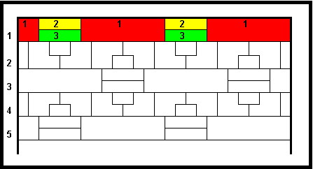
The boundaries displayed in Rows 1 to 4 are repeated down the map, ie, Row 5 has the same boundaries as Row 1, but may be coloured differently.

In colouring this map no two regions of the same colour may have part of a border in common and a row pattern is repeated across the row.
Tasks:
1. At which row could I soonest expect to see the exact colouring and layout pattern of Row 1?
2. Suggest a topologically simpler and what probably is a more aesthetic geometric layout for the vertices of my map?


